I redesigned my blog, again
Maybe you noticed the redesign. But most probably you did not, because you are first time here. It's normal, blogs are in decline probably since Google closed it's Reader service. Which was probably not a cause but symptom of that decline. And I do not even have RSS/Atom here (yet?).
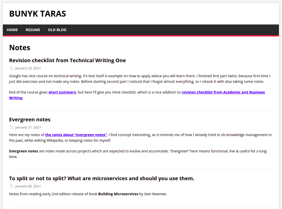
Anyway, my site here changed designs very often. First it was self-made static site generator in python that resolved JS dependencies. Then I added bootstrap. Then removed bootstrap. Then I got rid of my own generator and used Hugo. It looked like this:

I used it for couple of years, but did not like it for this reasons:
- I could not just add a file to posts folder, and expect post to appear, I need to use some Hugo command that creates it, with front-matter and other stuff.
- After post is created as a draft, I'm not sure how to change it's publication date. Just changing date in front-matter does not work. Some of my posts stay in draft phase for years (at least on Wordpress blog, here a little bit less, since even drafts could be regarded as published, if you push blog source files to GitHub.)
- Working with JS in Hugo and it's templates (go templates), is not much pleasure.
- Hugo is described as " The world’s fastest framework for building websites", but I don't care much about that yet. Maybe I'll care after I have a 1000 posts, but currently I don't mind waiting a couple of seconds.
But most important reason to switch was that I wanted to try to write something in React, and make this blog more dynamic.
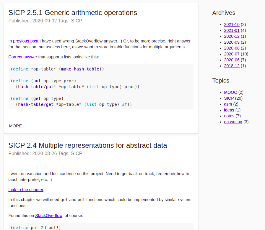
So I took the content of my blog as it was, markdown files with YAML front-matter. Then wrote some JS functions that load and query that files and transform markdown into HTML, and used that data as arguments to react components that build my blog. I also used Material UI components. It looked like this:

Then, I saw my blog on various devices, and noticed that since I have not a lot of skills in UI, my blog is not as responsive as I wanted it to be. And then, I thought, that given amount of content I have there is no much utility from tags or monthly archives, and got rid of them. Than it looked like Material UI is overkill for what was left there. So, I took inspiration from http://bettermotherfuckingwebsite.com/, and implemented my own theme in a under 30 lines of unminified CSS:
body {
	font-family: 'Helvetica', 'Arial', sans-serif;
	font-size:16px;
	color:#24292f;
	margin:40px auto;
	padding:0 10px;
	line-height: 1.5;
	max-width:830px;
}

h1,h2,h3 {
	line-height:1.25;
	border-bottom:1px solid #eee;
}

footer {
	margin-top: 1em;
	padding-top: 0.5em;
	border-top: 1px solid #eee;
}

nav a {
	margin-right: 1em;
}

img {
	width: 100%;
	border: 2px outset #eee;
}
And navigation here is could not be more simpler. You have home page that links to every post. Every post links back to it. Period.
Now the missing features are comments, analytics and RSS. And fix rendering of LaTeX.
Comments are probably most important, because otherwise I'll not be able to receive feedback. And without anyone telling me that I'm writing some bullshit - how would I improve my writing? I'm thinking to maybe build something using Google docs (Article about implementing comments for Jekyll blog using Google Forms), but that will take more time. Maybe I'll enable Disqus again. It has downsides, but a lot of sites use it and not complain.